// VIEW LIVE_SITE
Designing an end-to-end AI interview experience
From role discovery to behavior-changing feedback — shipped under real startup constraints
Role & Scope
Sole UX Designer (Mobile + Desktop)
End-to-end ownership: discovery → execution → iteration
Direct collaboration with founder & engineers
Product
Lemmino — AI interview & role-play platform
• B2B SaaS (sales & customer-facing roles)
The Core Problem~
AI interview platforms evaluate performance well, but fail at guiding improvement — especially after failure, where feedback often feels final and discouraging.
Impact & Outcomes~
• Designed the core interview and feedback experience used across all AI roles
• Shipped designs that moved into active development with engineers
• Defined post-interview states (fail / partial / success) to prevent user drop-off after & reduce discouragement
*This was a real product with real users — not a speculative concept project.
Lemmino is a real AI interview platform where I owned end-to-end UX decisions under ambiguity, business constraints, and evolving technical limitations — with a specific focus on post-interview feedback across success, partial success, and failure.
Why This Matters
Most Al interview tools optimize for scoring accuracy. Lemmino needed to optimize for user motivation and repeat practice.
The following work focuses on how post-interview feedback was designed as a system — not a screen — to support learning, trust, and forward momentum.
Understanding Post-Interview Emotional States
Completing an AI-led interview is not a neutral moment.
Users exit the experience in a heightened emotional state — anxious, self-critical, and uncertain about how their performance was interpreted.
Unlike human interviews, AI systems lack empathy cues, conversational closure, and opportunities for clarification — making feedback feel final and opaque.
Through early analysis of existing AI-led interview flows and internal discussions, three recurring post-interview emotional states emerged:
(high discouragement risk)
Failure~
Users perceive rejection as a personal deficit rather than a skill gap.
(uncertainty risk)
Ambiguous outcome~
Users feel confused about where they stand or how close they were.
(need for meaningful reinforcement)
Success!
Users receive validation but little actionable insight to improve further.
The UX challenge was designing feedback that supported learning, motivation, and forward momentum — especially after failure.
Defining Feedback as a System (Not a Screen)
AI interview feedback is often treated as a single outcome screen — a score, a verdict, or a summary. This approach assumes that feedback is a static piece of information.
In reality, feedback is a system: a sequence of messages, signals, and actions that shape how users interpret performance, regulate emotion, and decide what to do next.
Designing a single “result screen” would not solve the problem. The challenge was to design a feedback system that adapts to different emotional states while maintaining trust, clarity & forward momentum.
Design Principles
These principles guided how feedback was structured across all outcome states.
1. Separate Judgment from Learning
Acknowledge outcomes before introducing improvement guidance.
2. Reduce Emotional Load Before Cognitive Load
Immediately after interviews, users were emotionally activated.
3. Feedback Should Signal Progress, Not Finality
Outcomes needed to feel part of a learning trajectory, not a terminal verdict.
4. Consistency Across Outcomes Builds Trust
Different outcomes needed to feel related, not disconnected.
System Architecture
Based on these principles, post-interview feedback followed the same underlying structure across Failure, Partial Success, and Success:
1. Outcome clarity (what happened)
2. Emotional stabilization (how to interpret it)
3. Actionable direction (what to do next)
→ Where they stand
→ Why the result occurred
→ How to improve or proceed
This ensured that regardless of outcome, users always knew:
Treating feedback as a system — rather than a single screen
— allowed Lemmino to support learning, maintain trust in AI evaluation, and encourage repeat practice.
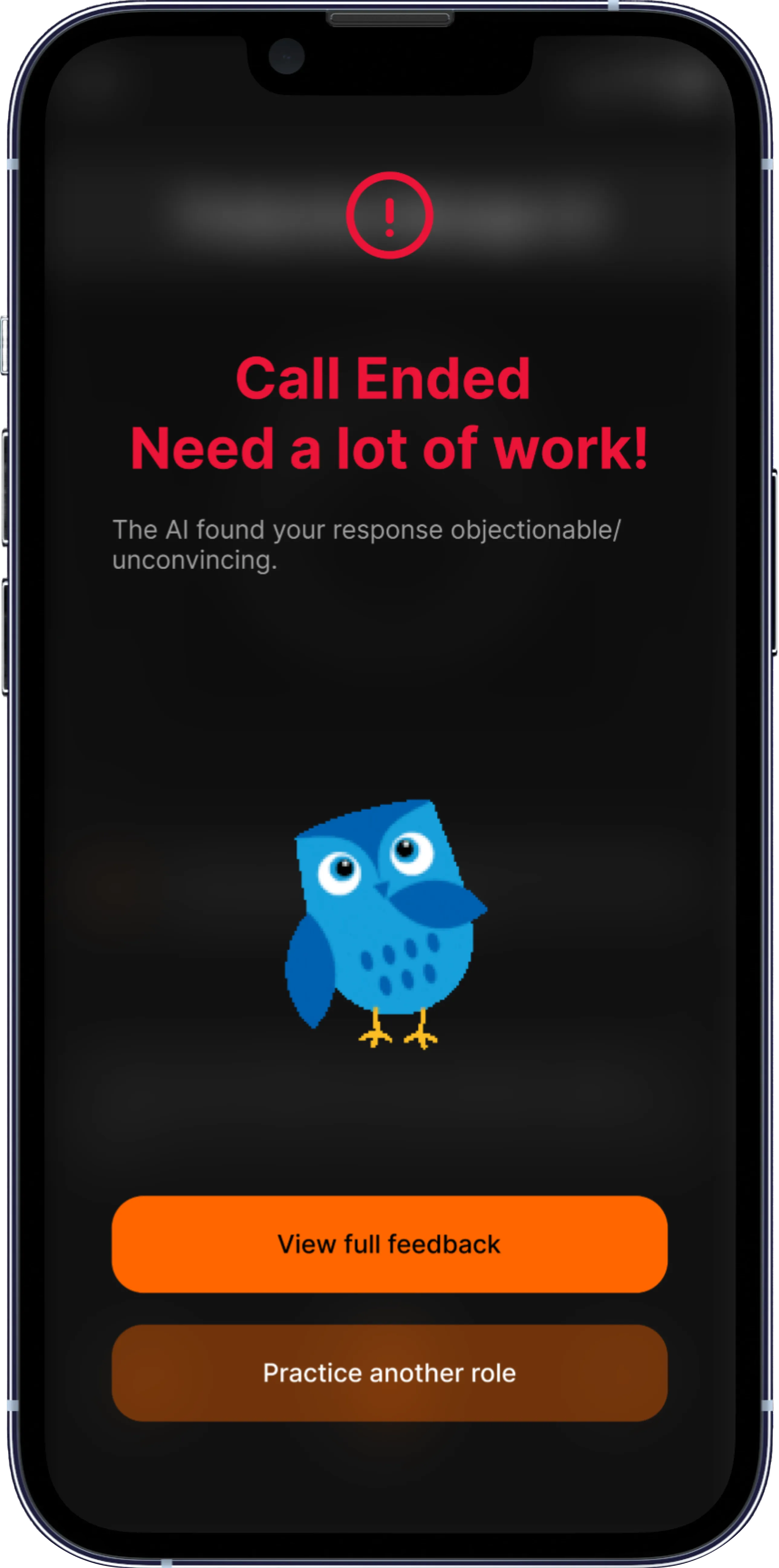
Designing for Failure, Not Just Success
Failure is the most emotionally fragile and high-risk trust moment in an AI-led interview.
In Lemmino, users had no human reassurance, no chance to clarify, and no emotional buffer. Poor failure feedback didn’t just end sessions — it ended willingness to retry.
Rather than avoiding failure, I treated it as a first-class design problem.
Failure Required a Different UX Contract
The failure state needed to do three things simultaneously: clarify what happened, protect user identity, and preserve forward momentum.
The design challenge was not to soften failure, but to reframe it as a temporary state tied to skills — not identity.
Key Design Decisions
1. Separate the person from the performance
Failure messaging avoided labels (“not ready”, “rejected”) & instead framed outcomes as specific skill gaps, preventing users from interpreting the result as a personal verdict.
2. Replace judgment with diagnosis
Instead of generic rejection states, feedback explicitly highlighted what limited progression (e.g., communication clarity, structure, confidence) and why those skills mattered for the role.
3. Preserve forward momentum
Every failure state ended with a clear next action — retry, targeted practice, or skill-specific improvement — so users were never left at a dead end.
Resulted in
Failure stopped being a terminal state.
Users consistently exited failure screens knowing what went wrong, why it mattered, and what to do next, which reduced drop-off after unsuccessful interviews and increased willingness to retry.
Designing for Ambiguity: Partial Success States
Partial success represented the most cognitively ambiguous state in the system.
Users felt close to success but lacked clarity on what actually blocked conversion — creating hesitation, not motivation.
The Risk of Ambiguity
If failure risked discouragement, partial success risked indecision.
Key Design Decisions
1. Explicitly naming the state
By labeling the outcome as “Almost There,” the system creates a distinct mental category between passing and failing that helps users process the result without self-blame.
2. Highlighting blockers, not weaknesses
Feedback surfaces the one or two dominant factors that limited progression for that role, avoiding overwhelming users with exhaustive critique.
3. Actionable progression paths
Each partial success state offers targeted next steps — practice modules, retry suggestions, or role-specific guidance — to convert proximity into progress.
Outcome of This Approach
Partial success stopped being a confusing middle state.
This design reduced ambiguity at a critical decision point, helping users understand why they didn’t convert and what specifically to improve before the next attempt.

Designing for Success (Without Complacency)
Success introduced a different risk: overly celebratory feedback could reduce perceived rigor and weaken trust in the system.
Early exploration showed that generic “Congratulations” states felt satisfying but failed to explain why success occurred.
Key Design Decisions
1. Evidence-based validation
Success feedback highlights specific behaviors (clarity, structure, confidence) rather than abstract praise, reinforcing trust in the AI’s judgment.
2. Progress framing, not completion framing
Language positions success as a milestone in a longer learning trajectory
3. Optional next steps
Users are offered non-intrusive next actions such as advanced roles or deeper practice, preserving autonomy rather than forcing progression
Outcome of This Approach
Success felt earned and explainable
— reinforcing trust in the system while encouraging continued practice rather than complacency.

Trade-Offs & Constraint
→
Why it mattered
→
Decision
Speed vs Depth
Chose progressive feedback instead of exhaustive reports
→ Reduced cognitive overload post-failure
Accuracy vs Emotional Safety
Softened language without hiding performance gaps
→ Maintained trust while encouraging retry
Founder Vision vs User Reality
Reframed “scoring” into “skill signals”
→ Shifted product from evaluative to coach-like
Mobile-first → Desktop-first pivot
Adapted flows for longer-form reflection
→ Enabled analytics + deeper feedback consumption
What This System Enabled
• One shared framework
• Three calibrated emotional responses
• Predictable, trustworthy feedback regardless of outcome
From Feedback to Behavior Change
— The Analytics Layer
Post-interview feedback addressed the immediate emotional moment.
Analytics extended that moment into a longitudinal learning loop — helping users recognize patterns across attempts, not just outcomes.
Rather than reinforcing a single verdict, analytics were designed to support progressive improvement over time.
Metric System Structure
Interview performance was represented across 3 distinct layer of performance — enabling focused improvement without overlap.
• Core Speaking Skills
(mechanical)
• Behavioral Signals
(psychological)
• Language Quality
(linguistic)
This structure allowed users to understand where to improve without being overwhelmed by raw scores or exhaustive breakdowns.
Why Visual-First Analytics
Analytics were designed for rapid pattern recognition under emotional load.
Visual signals made trends scannable across sessions while preserving consistency with the feedback system’s tone
— keeping analytics instructional, not judgmental.
*The following sections break down how each metric dimension translated signals into concrete behavior change.
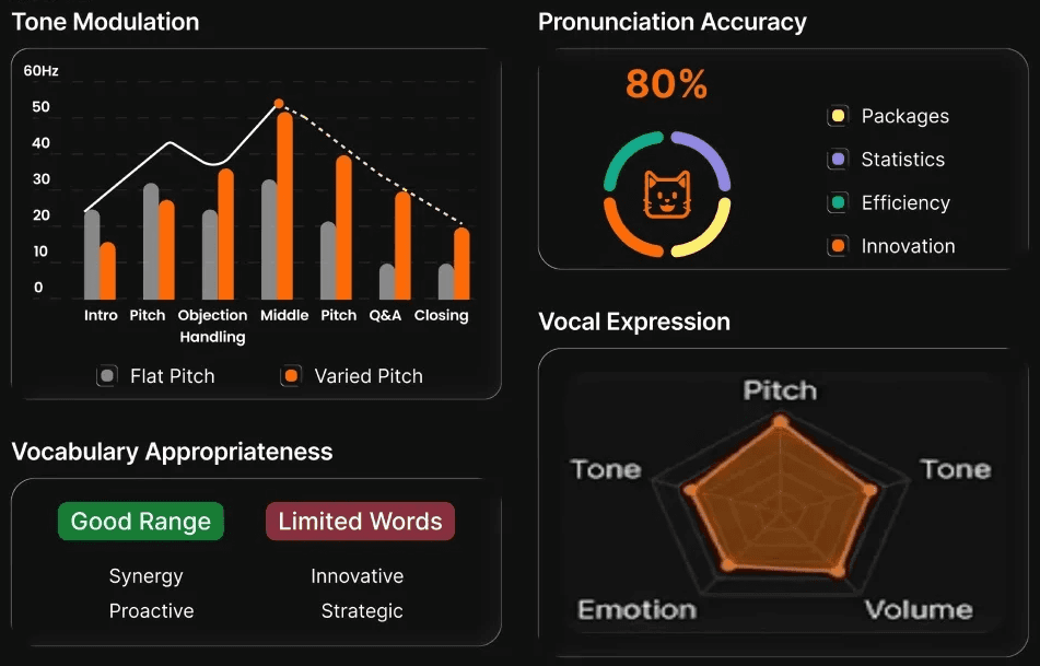
Core Speaking Skills
Making delivery visible without encouraging over-optimization
What the system surfaced
• Patterns in pacing, filler usage, tone stability, and vocabulary range
• Delivery trends across attempts rather than isolated moments
What I intentionally avoided
• Absolute scores that invite gaming or robotic speech
• Over-correction on surface polish at the expense of substance
Resulting behavior
Users could identify how their delivery impacted clarity and confidence, make targeted adjustments, and improve naturally without anxiety or over-optimization.
Core Speaking Metrics
Behavioral Signals
Helping users understand how they come across
— without labeling who they are
Behavioral Metrics
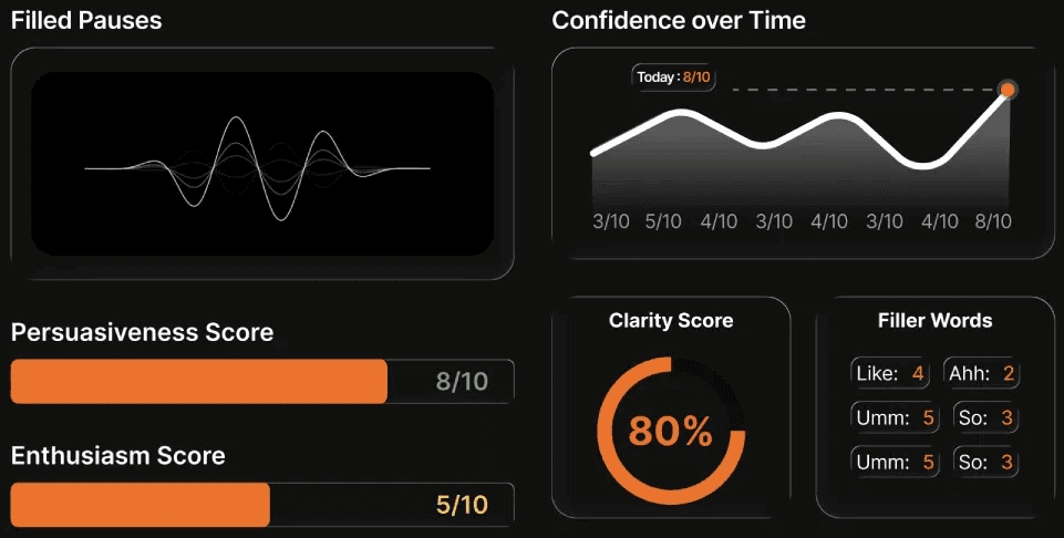
What the system surfaced
• Probabilistic cues related to confidence, hesitation, engagement, and responsiveness
• Consistent patterns across interviews rather than single-session verdicts
What I intentionally avoided
• Personality labels or definitive judgments
• Treating behavioral signals as objective truth rather than indicators
Resulting behavior
Users gained calibrated self-awareness about perception in interviews, without internalizing feedback as personal identity — preserving trust while guiding improvement.
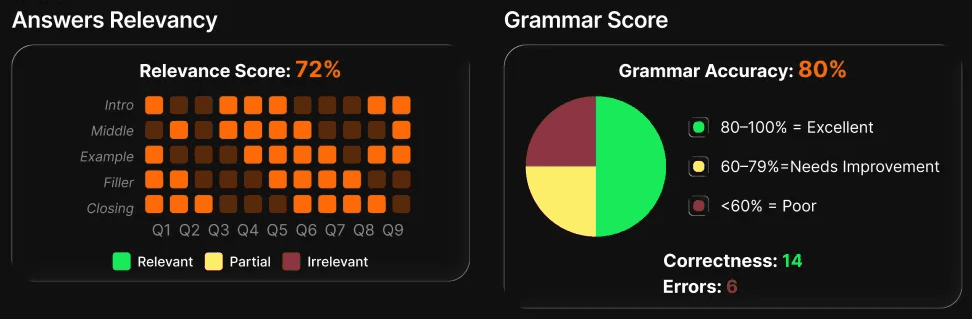
Language Quality
Supporting clarity and fairness without penalizing expression
What the system surfaced
• Patterns in structure, clarity, repetition, and phrasing effectiveness
• Language signals contextualized by role expectations, not linguistic perfection
What I intentionally avoided
• Redlining mistakes or overwhelming users with corrections
• Penalizing non-native speakers for stylistic variance
Resulting behavior
Users focused on improving communication effectiveness over time, rather than obsessing over errors — reinforcing confidence, inclusivity, and sustained practice.
Language Metrics
Together, these layers allowed feedback to evolve from a single outcome into a long-term learning loop — reinforcing trust, motivation, and repeat practice.
End-to-End Experience Ownership
I owned UX across the full AI interview journey — from first interaction to post-interview feedback and monetization.
As the sole designer, I prioritized system-level decisions and edge-case handling that reduced long-term design debt, rather than short-term visual polish.
1. Role Discovery & Selection
Designed industry- and role-specific discovery flows that reduced friction before users reached the interview.
2. Pre-Interview Readiness
Built gated readiness states and system checks to prevent technical failures and reduce user anxiety.
3. Live AI Interview Experience
Designed real-time interview controls and interaction patterns to keep cognitive load near zero during high-pressure moments.
4. Post-Interview Outcome States
Created distinct feedback experiences for success, partial success, and failure — reframing outcomes as skill gaps, not personal judgment.
5. Analytics & Feedback Systems
Designed visual-first analytics that prioritized directional signals over absolute scores to support behavior change.
6. Conversion & Pricing Experience
Designed trial, upgrade, and pricing flows where UX directly influenced monetization and product viability.
7. Platform & Trust Strategy
Led the shift from mobile-first to desktop-first for B2B usage, and designed landing and onboarding experiences to establish trust in a new AI product.
Scope Reality Check
• Sole UX designer
• Direct collaboration with founder and engineers
• Shipped designs under evolving product and technical constraints
This was not a concept case study. This was real UX ownership in a real startup environment.
Outcomes & Impact
This work established Lemmino’s post-interview experience as a repeatable feedback system, not a set of one-off result screens — supporting learning, trust, and continued practice across roles.
• Introduced three calibrated post-interview states (failure / partial / success) now used across all AI interview flows
• Reduced post-failure drop-off by reframing feedback from verdicts to skill-based improvement paths
• Enabled analytics-first UX that supports iteration, model improvement, and conversion loops (retry, upgrade, continued learning)
Read more
Lemmino is not a collection of screens — it is a feedback system designed to respect user psychology while enabling measurable improvement.
What I Learned
Designing feedback for AI systems requires treating outcomes as learning states, not verdicts.
When feedback respects user psychology, it can maintain trust while still being honest, actionable, and measurable.
Good UX is less about adding features — and more about deciding what not to surface, when, and why
Dhanyawad
ッ

Design isn't about Aesthetics, it's about Storytelling, evoking emotions and driving actions